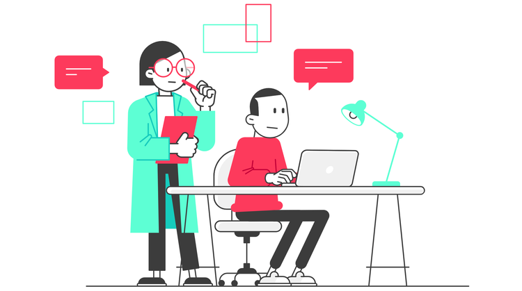
 Usability Testing Definition Usability testing refers to evaluating a product or service by testing it with representative users. Typically, during a test, participants will try to complete typical tasks while observers watch, listen and takes notes. Goal(s) The goal is to identify any usability problems, collect qualitative and quantitative data and determine the participant's satisfaction with the product. Benefits of Usability Testing Usability testing lets the design and development teams identify problems before they are coded. The earlier issues are identified and fixed, the less expensive the fixes will be in terms of both staff time and possible impact to the schedule. During a usability test, you will: • Learn if participants are able to complete specified tasks successfully and • Identify how long it takes to complete specified tasks • Find out how satisfied participants are with your Web site or other product • Identify changes required to improve user performance and satisfaction • And analyze the performance to see if it meets your usability objectives Purpose The purpose of usability testing is to ensure the plan for a product's functions, features and overall purpose are in line with what users want by observing how real-life people use the product. Usability testing allows you to learn things about user behavior, needs, and expectations upfront. 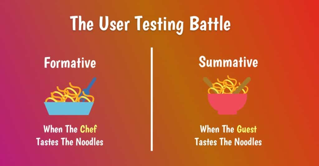 Formative Usability Testing vs, Summative Usability Testing Formative Usability Testing Used during the early stages of the design and development process, the formative method identifies the issues with user interface (UI) design and provides solutions to solve those issues during the primary stages of the development process. Summative Usability Testing Summative user testing are done after the product has been launched in the market. Conducted by a group of more than ten testers, the data collected are more about the quantity than the quality of the design (as in, what is the percentage of the users who could use the product without running into a roadblock?), and that is why another name for summative user testing is quantitative user testing. The Difference Between The Two: Formative And Summative Formative -answer the why and how questions of the design usability. -performed during the initial stages of design and development. Summative -answer the question regarding how many or how much. -performed when the product is already completed and launched in the market. This process is more about the evaluation of the design than improving the design.
0 Comments
 1. Visibility of system status The design should always keep users informed about what is going on, through appropriate feedback within a reasonable amount of time. When users know the current system status, they learn the outcome of their prior interactions and determine next steps. Predictable interactions create trust in the product as well as the brand.  2. Match between system and the real world The design should speak the users' language. Use words, phrases, and concepts familiar to the user, rather than internal jargon. Follow real-world conventions, making information appear in a natural and logical order. 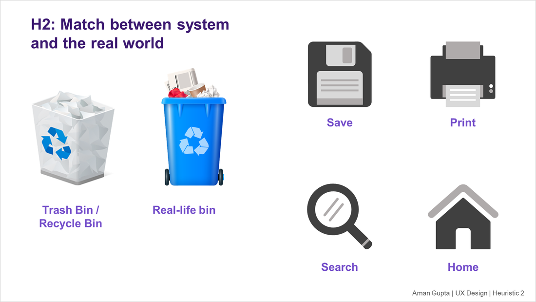 3. User control and freedom Users often perform actions by mistake. They need a clearly marked "emergency exit" to leave the unwanted action without having to go through an extended process. 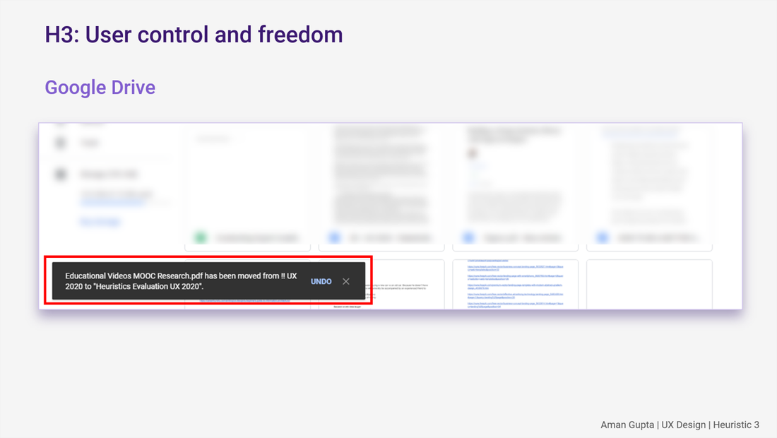 4. Consistency and standards Users should not have to wonder whether different words, situations, or actions mean the same thing. Follow platform and industry conventions.
5. Error prevention Good error messages are important, but the best designs carefully prevent problems from occurring in the first place. Either eliminate error-prone conditions, or check for them and present users with a confirmation option before they commit to the action. 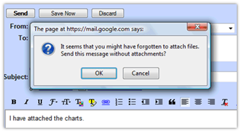 6. Recognition rather than recall Minimize the user's memory load by making elements, actions, and options visible. The user should not have to remember information from one part of the interface to another. Information required to use the design (e.g. field labels or menu items) should be visible or easily retrievable when needed.  7. Flexibility and efficiency of use Shortcuts — hidden from novice users — may speed up the interaction for the expert user such that the design can cater to both inexperienced and experienced users. Allow users to tailor frequent actions.
8. Aesthetic and minimalist design Interfaces should not contain information which is irrelevant or rarely needed. Every extra unit of information in an interface competes with the relevant units of information and diminishes their relative visibility. 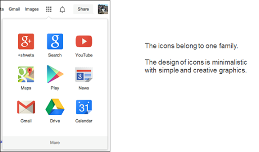 9. Help users recognize, diagnose, and recover from errors Error messages should be expressed in plain language (no error codes), precisely indicate the problem, and constructively suggest a solution. 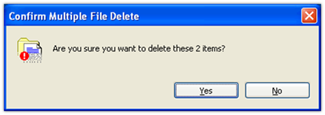 10. Help and documentation It’s best if the system doesn’t need any additional explanation. However, it may be necessary to provide documentation to help users understand how to complete their tasks.   Eberts (1994) describes four Human-Computer Interaction (HCI) design approaches that may be applied to user interface designs to develop user-friendly, efficient, and intuitive user experiences for humans. Anthropomorphic Approach The anthropomorphic approach to human computer interaction involves designing a user interface to possess human-like qualities. For instance, an interface may be designed to communicate with users in a human-to-human manner, as if the computer empathizes with the user. Interface error messaging in often written this way, such as, “We’re sorry, but that page cannot be found.” Affordances Human affordances are perceivable potential actions that a person can do with an object. In terms of HCI, icons, folders, and buttons afford mouse-clicking, scrollbars afford sliding a button to view information off-screen, and drop-down menus show the user a list of options from which to choose. Similarly, pleasant sounds are used to indicate when a task has completed, signaling that the user may continue with the next step in a process. Examples of this are notifications of calendar events, new emails, and the completion of a file transfer. Constraints Constraints complement affordances by indicating the limitations of user actions. A grayed-out menu option and an unpleasant sound (sometimes followed by an error message) indicate that the user cannot carry out a particular action. Affordances and constraints can be designed to non-verbally guide user behaviors through an interface and prevent user errors in a complex interface. Cognitive Approach The cognitive approach to human-computer interaction considers the abilities of the human brain and sensory-perception in order to develop a user interface that will support the end user. Metaphoric Design Using metaphors can be an effective way to communicate an abstract concept or procedure to users, as long as the metaphor is used accurately. Computers use a “desktop” metaphor to represent data as document files, folders, and applications. Metaphors rely on a user’s familiarity with another concept, as well as human affordances, to help users understand the actions they can perform with their data based on the form it takes. For instance, a user can move a file or folder into the “trashcan” to delete it. Attention and Workload Models When designing an interface to provide good usability, it is important to consider the user’s attention span, which may be based on the environment of use, and the perceived mental workload involved in completing a task. Typically, users can focus well on one-task-at-a-time. For example, when designing a web-based form to collect information from a user, it is best to contextually collect information separately from other information. The form may be divided into “Contact Information” and “Billing Information”, rather than mixing the two and confusing users. Human Information Processing Model Human Information Processing (HIP) Theory describes the flow of information from the world, into the human mind, and back into the world. When a human pays attention to something, the information first gets encoded based on the sensory system that channeled the information (visual, auditory, haptic, etc.). Next, the information moves into Working Memory, formerly known as Short-Term memory. Working Memory can hold a limited amount of information for up to approximately 30 seconds. Repeating or rehearsing information may increase this duration. After Working Memory, the information may go into Long-Term Memory or simply be forgotten. Long Term Memory is believed to be unlimited, relatively permanent memory storage. Empirical Approach The empirical approach to HCI is useful for examining and comparing the usability of multiple conceptual designs. This testing may be done during pre-production by counterbalancing design concepts and conducting usability testing on each design concept. Often, users will appreciate specific elements of each design concept, which may lead to the development of a composite conceptual design to test. Human Task Performance Measures In addition to a qualitative assessment of user preferences for a conceptual design, measuring users’ task performance is important for determining how intuitive and user-friendly a web page is. A researcher who is familiar with the tasks the web page has been designed to support will develop a set of test tasks that relate to the task goals associated with the page. A/B Testing If two of three design concepts were rated highly during user testing, it may be advantageous to conduct an A/B Test during post-production. Predictive Modeling Approach GOMS is a method for examining the individual components of a user experience in terms of the time it takes a user to most efficiently complete a goal. GOMS is an acronym that stands for Goals, Operators, Methods, and Selection Rules (Card, Moran, & Newell, 1983) Goals -Goals are defined as what the user desires to accomplish on the website. -What the user wants to achieve; can be broken down into sub-goals. Operators -are the atomic-level actions that the user performs to reach a goal, such as motor actions, perceptions, and cognitive processes. -An action performed in service of a goal; can be perceptual, cognitive or motor acts. Methods -are procedures that include a series of operators and sub-goals that the user employs to accomplish a goal. -Sequences of operators and sub goal invocations that accomplish a specified goal. Selection Rules -refer to a user’s personal decision about which method will work best in a particular situation in order to reach a goal. -Represent the user’s knowledge of which method should be applied. The GOMS model is based on human information processing theory, and certain measurements of human performance are used to calculate the time it takes to complete a goal. For example, the average time it takes a human to visually fixate on a web page, move eye fixation to another part of the web page, cognitively process information, and make a decision of what to do next can be measured in milliseconds. 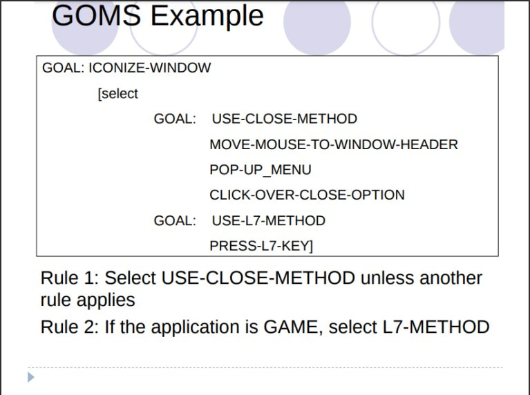 Donald Norman Donald Arthur Norman is an American researcher, professor, and author. Norman is the director of The Design Lab at University of California, San Diego. He is best known for his books on design, especially The Design of Everyday Things.  Donald Norman's Seven Stages of Action 1. User establishes the goal 2. Formulates intention 3. Specifies actions at interface 4. Executes action 5. Perceives system state 6. Interprets system state 7. Evaluates system state with respect to goal 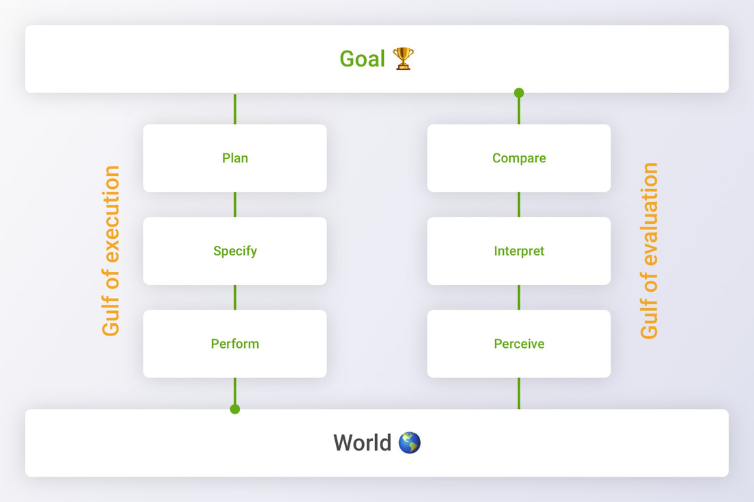 Example: Lets you are imagine you are alone at home and bored, So you go and watch a movie. • Though this looks simple, our human brain executed it in the following way 1)I want to kill my boredom (Goal) Execution 2) Movie seems to be a good idea (Plan) 3)You check for the nearest theater and show time (Specify) 4) Purchase ticket and sit in the movie hall (Perform) Evolution 5 ) Watch audio, Video affects of the movie (Perceive) 6) Interpret effects to your understanding ( Reflect) 7) After movie it was a good time pass (Compare) Know thy user
“Know Thy User” The foremost creed in HCI is to devise interaction and interfaces around the target users. This principle simply states that the interaction and interface should cater to the needs and capabilities of the target user of the system in design. Understand the Task Base HCI design on the understanding of the task. The term task refers to the job to be accomplished by the user through the use of the interactive system Reduce Memory Load Designing interaction with as little memory load as possible is a principle that also has a theoretical basis. Keeping the user’s short-term memory load light is of particular importance with regard to the interface’s role as a quick and easy guidance to the completion of the task. Strive for Consistency Strive for consistency by utilizing familiar icons, colors, menu hierarchy, call-to-actions, and user flows when designing similar situations and sequence of actions. Standardizing the way information is conveyed ensures users are able to apply knowledge from one click to another; without the need to learn new representations for the same actions. Consistency plays an important role by helping users become familiar with the digital landscape of your product so they can achieve their goals more easily. Remind Users and Refresh Their Memory Any significant task will involve the use of memory, so another good strategy is to employ interfaces that give continuous reminders of important information and thereby refresh the user’s memory. Prevent Errors/Reversal of Action Designers should aim to offer users obvious ways to reverse their actions. These reversals should be permitted at various points whether it occurs after a single action, a data entry or a whole sequence of actions. As Shneiderman states in his book, this feature relieves anxiety, since the user knows that errors can be undone; it thus encourages exploration of unfamiliar options. Naturalness It refers to a trait that is reflective of various operations in our everyday life. |

 RSS Feed
